Along with many political analysts, we’re still taking stock of what happened in the 2016 election and the implications of the outcome for the future. Some observers have suggested that campaigns should give less consideration to data and metrics going forward. We would caution against this conclusion. In many cases, existing metrics like the NCEC’s Democratic Performance Index(DPI) accurately depicted the competitive nature of marginal congressional seats. However, the impact of Donald Trump’s candidacy had little precedent and proved difficult to predict—leaving progressives with the feeling that our candidates had underperformed in the 2016 General Election. Essentially, the NCEC’s DPI is a politically-informed, granular, moving average of actual candidate performance. By comparing DPI to the 2016 results, we can identify areas where Democratic support deteriorated and help to quantify Mr. Trump’s impact lower down the ballot.
The Democratic Performance Index proved to be accurate among many of the districts in the congressional battleground. Our assessment is based on comparing the Democratic candidate’s major-party share to our DPI. These comparisons are noteworthy because campaigns that utilize DPI make critical resource allocation decisions based on the metric.
In the 30 most competitive House races—where we devoted most of our attention—the mean discrepancy between the pre-election Democratic Performance and the outcome was a closely-correlated 3.0 percentage points. That is the mean unsigned difference, irrespective of whether DPI was above or below the major-party House vote. The absolute difference varies over the range 0.2 to 8.9 points, with a median of 2.3 points.
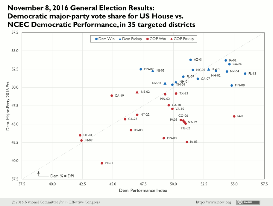
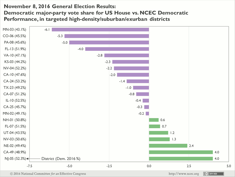
We consider 21 of the 30 districts to be non-rural. In 14 of them, the Democratic House candidate ran below Democratic Performance. There were three districts—Colorado’s 6th, Minnesota’s 3rd, and Pennsylvania’s 8th Districts—where the House candidate performed 5 points or more below Democratic Performance. Considering the presidential vote in this subset , the party’s eagerness to compete is understandable—Barack Obama won 16 of the districts in 2012 and 22 in 2008. The competitiveness of these districts is again underlined by the two most recent gubernatorial contests though—voters cast a majority of the vote for the Democrat in nine and eight of the districts, respectively. The result in Colorado’s 6th District is potentially the most troubling in this group, after voters there had shown considerable support for both President Obama and Governor Hickenlooper. In the other two, Democratic vote share hovers consistently near 50 percent. Nevertheless, these results show that this cornerstone metric is still a strong measure of likely Democratic support.
While it is satisfying to focus on the areas where DPI closely tracked the eventual result, delving into where it missed the mark may be more important. Democratic Performance Index is based entirely on results from previous elections, so examining where candidates underperformed highlights the communities where Democratic support has collapsed in comparison to recent elections.
There were nine largely rural districts, considered marginal at least into October, where the difference between the Democratic major-party share and DPI averaged 4.3 percentage points, substantially higher than the non-rural districts discussed above.
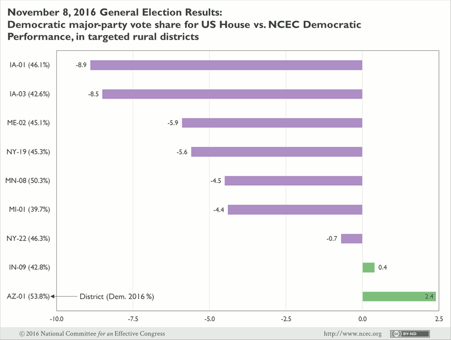
Clearly, the results in Iowa hurt the overall numbers, largely due to Donald Trump’s 10-point statewide victory margin. This is the second consecutive election where results in Iowa were disappointing. Further, several of these districts are in rural areas where Democrats enjoyed support even in congressional elections as recently as 2006 but, evidently, the support levels have continued to wane. Solving how to reconnect with these communities will be immensely important to Democratic congressional prospects in coming cycles. Still, we remain confident that this bunch of districts will be competitive into the future.
We should also note a few other races where it was assumed the Democratic candidate was safe, but the pre-election DPI should have worried us, even though polls (dubiously) showed the Democratic incumbent far ahead:
| District | Dem. Major Party % | 2016 DPI | Difference |
|---|---|---|---|
| IA-02 | 53.7 | 54.3 | 0.6 |
| MN-01 | 50.4 | 49.9 | 0.5 |
| MN-07 | 52.5 | 47.3 | 5.2 |
| NH-02 | 52.3 | 53.5 | -1.2 |
| NY-03 | 52.4 | 51.6 | 0.8 |
We recognize that this draws from the results of a single election cycle, upon which it is difficult to base conclusions, but as we all continue the postmortem of this election it is important to recognize that fundamental predictive metrics like DPI remain highly accurate.